Good outfit color matching isn't about obeying a rigid color wheel. The strongest color combinations outfits depend on the effect you want, the level of contrast you can carry, the occasion, the texture of each fabric, and where each color sits on the body. A quiet tonal outfit can look polished, while a bright contrast can direct attention to a jacket, shoe, or accessory.
The ten systems below move from low-contrast tonal dressing to expressive heritage and multicolor schemes. Each one includes a simple palette key, practical outfit formulas, proportion guidance, do's and don'ts, and production considerations for Genpire-ready product development.
Use this visual key throughout: D means dominant color, S means supporting color, and A means accent color. The color order matters because placement changes the perceived balance of an outfit. Consumers customizing products often favor simple, visually coherent palettes, selecting similar colors, avoiding stronger contrast, and using limited palette breadth even when many options are available, as reported in this study of online color customization behavior. That makes proportion just as important as color selection.
Table of Contents
- 1. Monochromatic Color Blocking
- 2. Neutral Base With Bold Accent
- 3. Analogous Color Harmony
- 4. Earth Tone and Natural Palette
- 5. Pastels and Soft Tone Combinations
- 6. Complementary Color Contrast
- 7. Triadic Color Scheme
- 8. Split Complementary Color Pairing
- 9. Shades and Tints Gradation
- 10. Cultural and Heritage Color Stories
- 10-Style Color Combo Comparison
- Turn a Palette Into a Repeatable Outfit System
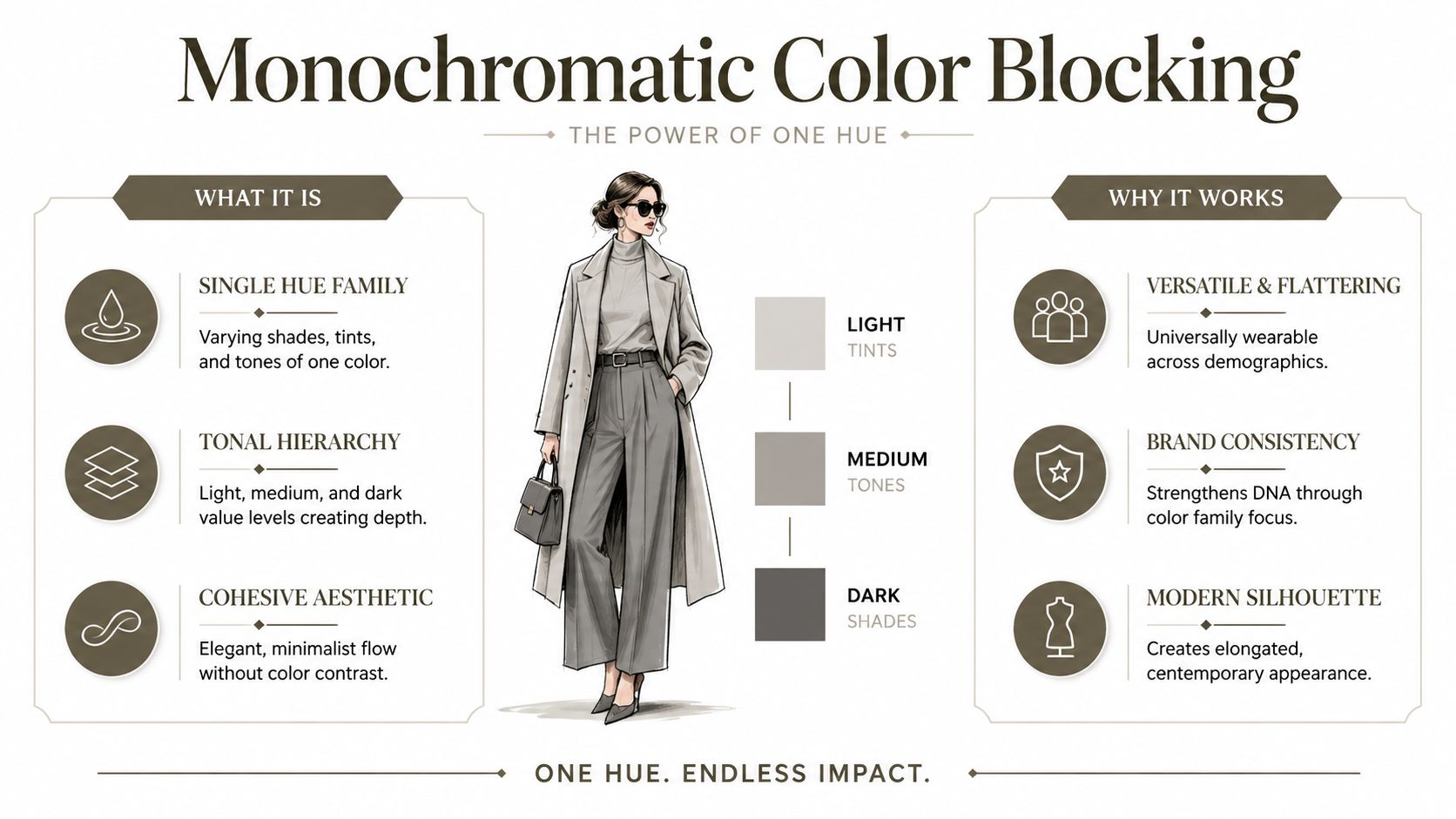
1. Monochromatic Color Blocking
Monochromatic dressing works through controlled variation, not one identical color repeated from head to toe. Keep one hue, then shift its lightness, darkness, saturation, or surface finish. Charcoal trousers, a medium-grey knit, and a mist-grey coat stay in one family while their changing values create separation.
Palette swatches: D charcoal, S medium grey, A mist grey.
Use a dark base, a middle layer, and a lighter outer piece. Charcoal wide-leg trousers with a graphite turtleneck and pale grey wool coat create a long, steady visual path. A light cashmere cardigan and grey suede shoes make the same palette softer. For an occasion, wool supports a polished office outfit, while knitwear and suede suit a relaxed setting.
Proportion and texture
Dark shades recede, so place them on areas you want to reduce visually. Light shades draw attention toward the upper body, waist, or footwear. To make the body appear longer, keep large vertical sections close in value and avoid a sharply contrasting belt that cuts across the line. A lighter shoe can shift attention downward, while a pale coat broadens the upper frame visually.
Texture supplies the depth that stronger color contrast would provide. Combine knit, silk, linen, leather, or brushed wool within the same hue. A matte trouser beside a softly glossy blouse creates separation without interrupting the palette.
Practical rule: Keep the hue consistent, then build interest through value, texture, and silhouette.
For Genpire-ready development, approve more than one digital swatch. Follow this AI outfit generator workflow to review the palette from front, side, and back views, then record the selected values in Brand DNA. Check each fabric under the same lighting, since sheen can make one color appear lighter. A tonal collection can retain one color language across garments while varying surfaces, trims, and silhouettes. To scale recommendations, a 24/7 sales assistant for apparel can suggest coordinate pieces that preserve tonal harmony across customer fits.
2. Neutral Base With Bold Accent
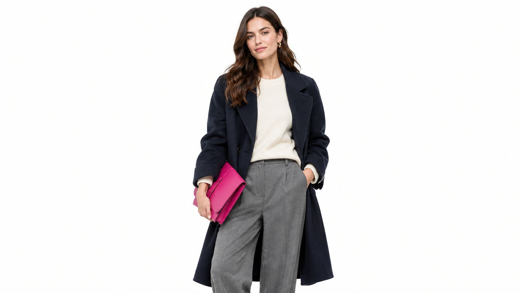
A neutral base with one vivid accent gives an outfit structure without making color feel difficult to wear. Black, white, beige, grey, and navy can support a stronger shade such as cobalt, cherry red, emerald, or fuchsia.
Palette swatches: D navy, S ivory, A cobalt blue.
Start with navy trousers, an ivory shirt, and a cobalt coat. If that feels too strong, keep the coat neutral and move cobalt to a bag, scarf, shoe, collar, cuff, or pocket detail. A grey suit with a saturated knit works for a creative office, while a beige trench with a bright handbag gives a more relaxed weekend result.
The accent's location changes the body's visual emphasis. A bright top draws attention upward. A vivid shoe pulls the eye downward and can anchor a longer coat or wide trouser. A belt or pocket accent emphasizes the waist, so use that placement deliberately rather than adding bright details everywhere.
Building a repeatable collection
Neutral foundations should work across multiple seasons and garment categories. Accent colors can change while the base remains stable, which helps a brand refresh a collection without rebuilding its entire visual identity.
Do:
- Keep the base dependable: Choose neutral garments that can be combined across outfits.
- Use one clear focal point: Let the accent carry the visual energy.
- Test placement: Compare the accent on outerwear, knitwear, accessories, and trims.
- Plan modular details: Consider interchangeable panels, cuffs, collars, or pocket components.
Genpire's Brand DNA can store the core neutral palette, while its AI Editor helps test an accent across multiple garment views before sampling. The result is a system that supports both personal styling and controlled product development.
3. Analogous Color Harmony
Analogous palettes use neighboring colors that flow naturally into one another. Blue, blue-green, and teal create a cool, connected impression. Red, orange, and yellow feel warmer and more energetic. Because the colors share visual relationships, the outfit can feel coordinated without becoming monochrome.
Palette swatches: D deep teal, S sea green, A blue-green.
A wearable example is a deep teal coat over a sea-green sweater, with blue-green trousers or a muted teal skirt. For a warmer version, combine rust trousers, terracotta knitwear, and a subdued orange scarf. The strongest piece should usually carry the clearest saturation, while the surrounding colors support it with softer or darker values.
Use flow to guide the eye
Adjacent colors can create a visual path from one garment to the next. A darker coat over a medium-toned top and lighter trousers makes the outfit feel grounded. Reversing that order can bring more attention to the lower body or create a lighter, more open appearance.
This system works well for mood-driven collections. A forest palette can combine moss, olive, and sage. An ocean story can use navy, marine blue, and softened turquoise. Keep one color dominant so the outfit doesn't become a collection of equally loud pieces.
Do:
- Vary intensity: Pair a saturated focal color with quieter neighbors.
- Use texture for separation: A smooth blouse and textured knit can distinguish similar shades.
- Repeat one color subtly: Echo a coat color in a shoe, stitch, or bag.
- Document production targets: Record the approved color specifications for each supplier.
A moodboard can establish the narrative, while Genpire's Brand DNA can preserve the palette for later colorways. That helps a design team maintain the same ocean, forest, or sunset logic across garments and marketing visuals.
4. Earth Tone and Natural Palette
Earth tones borrow their character from soil, stone, wood, dried leaves, clay, and vegetation. Terracotta, ochre, sage, charcoal, cream, rust, sand, and olive can produce outfits that feel warm and grounded without relying on stark contrast.
Palette swatches: D olive, S sand, A terracotta.
Try olive utility trousers with a cream shirt and a terracotta overshirt. A charcoal jacket over a sand-colored knit and rust accessories gives the same grounded effect in a darker register. These combinations suit travel dressing, relaxed offices, outdoor-inspired wardrobes, and product stories built around natural materials.
Body placement is especially useful here because earth tones can shift from soft to assertive. A pale cream top brings light to the face. Charcoal or olive on the lower body creates visual weight and stability. Terracotta at the chest, sleeve, or shoe adds warmth without requiring a fully bright outfit.
Connect color with material honestly
Natural-looking color works best when the fabric supports the story. Linen, cotton, wool, canvas, leather, and textured knits can reinforce an organic impression. A highly synthetic shine may still work, but it changes the message and should be an intentional contrast rather than an accidental mismatch.
Avoid: Treating “natural” as a substitute for transparent sourcing. If a product uses natural fibers, dyes, or artisan techniques, describe those details accurately. If the palette is only inspired by scenery, say that plainly.
For a collection, store the earth-tone family in Brand DNA and test it under daylight, indoor lighting, and studio conditions. Product copy can explain the source of the inspiration, while technical documentation should identify the actual material, dye, and trim specifications. That separation keeps the visual narrative appealing without making unsupported sustainability claims.
5. Pastels and Soft Tone Combinations
Pastels use light, softened versions of color, including powder blue, blush pink, mint, lavender, and butter yellow. They create a gentle appearance, but they still need structure. Without a darker or cleaner supporting element, a pastel outfit can look visually washed out.
Palette swatches: D powder blue, S blush pink, A butter yellow.
A powder-blue shirt with blush trousers feels approachable for daytime. Add soft grey shoes or a crisp white layer to keep the combination defined. Butter-yellow knitwear with pale denim creates a casual outfit, while lavender tailoring with an ivory blouse gives the palette a sharper workwear direction.
Pastels can also alter perceived proportions. Light colors expand attention, so a pastel blazer can make the upper body more prominent. A darker shoe, belt, or bag can ground a pale outfit. If you want a longer uninterrupted line, keep the lower garments close in value and use contrast near the face or hands instead.
Production needs precision
Soft colors can shift noticeably between fabric types, dye processes, and lighting conditions. Record the intended color specifications in the technical documents, then test actual fabric submissions rather than approving the appearance from a screen alone.
Do:
- Add definition: Use white, soft grey, denim, or a deeper neutral.
- Check fabric behavior: Compare the same pastel across cotton, knit, silk, and synthetic surfaces.
- Review lighting: Photograph samples in natural, indoor, and studio conditions.
- Coordinate dye lots: Keep related garments visually consistent when they're sold as a set.
- Use controlled imagery: Soft lighting can show the palette without creating harsh color shifts.
Genpire's AI Editor can help review pastel colorways across product views, but physical sampling remains essential before production approval. Brand DNA can retain the approved palette and its specifications for later supplier communication.
6. Complementary Color Contrast
Complementary colors sit opposite each other in a traditional color-wheel relationship. Blue with orange and purple with yellow create immediate contrast, so the outfit feels energetic and highly visible.
Palette swatches: D royal blue, S warm white, A orange.
A royal-blue suit with an orange knit is a strong statement. A more wearable version uses blue denim, a neutral shirt, and an orange bag. Purple trousers with a soft yellow sweater can work when one color is muted and the other carries the focus. The pairing becomes easier when the colors don't have equal visual intensity.
Control the visual volume
Use the dominant color across the largest garment and place the complement in a smaller area. A blue coat with orange gloves feels controlled. An orange coat with blue shoes makes the outer layer the main event and keeps the accent lower on the body.
This system can also support body-proportion goals. Place the brighter color where you want attention, and use the deeper or less saturated color where you want visual recession. A neutral layer between the two can reduce the feeling of direct collision.
Strong complements work best when the eye knows which color to read first.
Do:
- Choose a clear leader: Let one color occupy the main garment.
- Soften one side: Desaturate or darken the supporting color when the pairing feels aggressive.
- Ground the outfit: Add neutral texture through denim, wool, canvas, or leather.
- Test the complete look: Check the colors on the actual silhouette, not only as flat swatches.
Genpire's Virtual Try-On Studio can help visualize the relationship on a body before production decisions are finalized. Marketing Studio can then show the same colorway in controlled editorial or e-commerce settings, allowing the team to assess how the contrast reads under different lighting.
7. Triadic Color Scheme
A triadic scheme uses three colors distributed around the color wheel, producing a lively but potentially complex result. Red, yellow, and blue are the familiar primary example, though fashion palettes often soften, darken, or shift those colors for greater wearability.
Palette swatches: D deep red, S muted yellow, A blue.
Try a deep red skirt with a muted yellow sweater and blue accessories. For a quieter version, use burgundy, ochre, and dusty blue. The colors don't need equal garment area. In fact, equal visual weight can make the outfit feel busy, especially when all three shades are saturated.
The dominant color should usually occupy the largest surface. A supporting color can define a second garment, while the third works best in a smaller accessory, print, stitch, or trim. This hierarchy helps the viewer understand the outfit quickly.
Make three colors wearable
Fashion collections can use triadic logic in prints, color-blocked knitwear, bags, belts, and footwear. A full outfit can work for a creative event or editorial setting, but daily wear often benefits from two quieter colors and one expressive note.
Research on clothing combinations found that stronger hue contrast can lower perceived beauty ratings, while tri-color judgments can involve faster decisions than bi-color judgments, suggesting that complexity may increase processing even when the result is visually energetic. The findings are discussed in this experiment on bi-color and tri-color clothing combinations. Treat triadic palettes as deliberate compositions, not automatic defaults.
Genpire's AI fashion design generator workflow can support multi-view exploration, color placement, and production-oriented development. Record which color is dominant and where each supporting shade appears so the factory doesn't interpret the palette as an equal split.
8. Split Complementary Color Pairing
Split complementary dressing keeps one base color and pairs it with the two colors beside its complement. Blue, red-orange, and yellow-orange create a dynamic palette, but the adjacent warm colors generally feel less abrupt than a direct blue-orange pairing.
Palette swatches: D navy, S red-orange, A yellow-orange.
A navy dress with a red-orange bag and yellow-orange earrings gives the system a small, wearable footprint. For a stronger outfit, use a navy jacket, red-orange trousers, and a yellow-orange scarf. A neutral shirt can separate the colors and make the combination suitable for a smart-casual setting.
The base color should usually cover the largest area. The two warm accents can sit at different heights, such as a top and shoe, or at the same level in small accessories. If both accents are bright and large, the outfit may lose its hierarchy.
Place contrast with purpose
Use this pairing when you want more interest than an analogous palette but less direct impact than a pure complementary one. It suits creative workwear, statement accessories, resort dressing, and graphic product lines.
A dark base can visually recede, while warm accents attract the eye. Put the red-orange near the face if you want warmth above the waist. Use yellow-orange at the waist or footwear to create a clear focal point. If the body already has strong horizontal divisions, keep the accents smaller to avoid adding unnecessary visual breaks.
Genpire's AI Editor can compare split-complementary versions across garment views. Store the approved color specifications in the tech pack, including the base, the two accents, and their exact placement. Marketing Studio can then test whether the colors remain distinct in product images, campaign scenes, and close-up detail shots.
9. Shades and Tints Gradation
Gradation moves gradually from a lighter tint to a darker shade, often across one garment or a coordinated outfit. An ombre skirt can begin with pale cream at the waist and deepen into magenta at the hem. The color family stays connected, while the transition creates movement.
Palette swatches: D pale cream, S rose pink, A deep magenta.
An ombre dress naturally directs the eye along the body. A lighter upper section can bring attention toward the face, while a darker hem grounds the silhouette. A gradient jacket can create a focal outer layer over a simple neutral base. For coordinated separates, keep the transition direction consistent so the pieces don't compete.
The technique works particularly well in knitwear, pleated garments, printed silk, scarves, bags, and footwear. It can also be subtle. A charcoal-to-grey sweater offers a restrained version, while a cream-to-magenta skirt is more expressive.
Specify the transition, not just the endpoints
Production teams need more than a start color and an end color. Define where the change begins, how it moves across the garment, and whether the effect comes from knitting, dyeing, printing, or panel construction. Physical fabric trials matter because surface texture can alter the apparent smoothness of the fade.
Production notes:
- Name the endpoints: Record the lightest and darkest approved colors.
- Map the placement: Show where the gradient starts and finishes on each panel.
- Test the method: Compare knit, dye, and print capabilities before selecting the process.
- Review lighting: Photograph the sample in natural and studio conditions.
- Protect consistency: Use the same placement logic across sizes and garment views.
Genpire's AI Editor can visualize gradient placement before sampling, while a structured tech pack can communicate the final construction and color instructions to suppliers.
10. Cultural and Heritage Color Stories
Heritage palettes draw from a specific cultural tradition, historical period, craft practice, or region. Indigo and rust can suggest Japanese textile traditions. Jewel tones may reference Indian textile histories. Nordic-inspired dressing often favors restrained greys and whites, while Mediterranean stories may combine blue with terracotta.
Palette swatches: D indigo, S natural cream, A rust.
A practical outfit might use an indigo overshirt, a cream shirt, and rust footwear or a woven bag. The colors can remain modern when the silhouette is contemporary and the product description explains the source accurately. The goal isn't to imitate a culture superficially. It's to develop a respectful, documented relationship with the visual language.
Build the story with accountability
Research the tradition before designing. Identify who created the technique, how the colors are used, and whether the proposed materials and processes align with the narrative. If artisans or cultural communities contribute, create meaningful partnerships, provide fair compensation, and give clear credit.
Avoid vague labels such as “tribal,” “exotic,” or “ethnic.” Name the region, craft, or historical reference only when the description is accurate and supported by the work behind the product. Cultural appreciation requires context, not just attractive swatches.
For brands, Genpire's fashion collection design guide can help organize references, moodboards, and product concepts before the collection reaches specification. Store the heritage palette in Brand DNA, then connect each color to its documented origin in product copy and marketing materials.
A print or flag project may need the same care with color fidelity and cultural context. For custom flag production, The Print Warehouse Ltd flags provides a relevant example of how color-led visual communication can extend beyond apparel.
10-Style Color Combo Comparison
| Style / Approach | Implementation complexity | Resource requirements | Expected outcomes | Ideal use cases | Key advantages |
|---|---|---|---|---|---|
| Monochromatic Color Blocking | Low–Medium, simple palette but requires undertone/textures | Low, fewer dye lots, varied fabrics/textures | Cohesive, elegant, minimalist aesthetic | Brand staples, premium basics, cohesive capsules | Simplifies production; consistent brand DNA; versatile |
| Neutral Base with Bold Accent | Low, clear base/accent split, easy proportions | Low–Medium, core neutrals + seasonal accent SKUs | Versatile, commercially reliable, easy mix‑and‑match | Mass market essentials, seasonal rotations, retail staples | Inventory efficiency; flexible seasonal variation; broad appeal |
| Analogous Color Harmony | Medium, manage saturation to avoid muddiness | Medium, multiple close hues, texture coordination | Harmonious, mood‑driven collections; editorial appeal | Seasonal storytelling, thematic collections, lifestyle brands | Natural visual harmony; strong emotional branding; photogenic |
| Earth Tone and Natural Palette | Low–Medium, muted palettes, attention to undertones | Medium–High, natural pigment sourcing, supply chain work | Warm, grounded, sustainability‑aligned aesthetic | Eco‑conscious brands, timeless collections, premium basics | Aligns with sustainability; universally flattering; authentic feel |
| Pastels and Soft Tone Combinations | Medium, precise specs and color accuracy required | Medium, careful dyeing/testing across fabrics | Soft, photogenic, youth‑oriented visual language | S/S collections, youth/IG‑focused brands, lifestyle edits | Highly photogenic; contemporary appeal; cohesive variety |
| Complementary Color Contrast | Medium–High, balance saturation to avoid garishness | Medium, high‑impact dyes, careful styling | High‑energy, attention‑grabbing, memorable products | Statement pieces, campaigns, limited editions | Strong visibility; immediate brand recall; social traction |
| Triadic Color Scheme | High, three‑color balance and hierarchy needed | High, more SKUs, complex specs and inventory | Vibrant yet balanced collections; distinctive imagery | Bold contemporary brands, accessories, prints | Distinctive and exciting; creative flexibility; memorable |
| Split Complementary Color Pairing | Medium–High, nuanced balance of three hues | Medium–High, precise allocation and specs | Sophisticated contrast with visual interest, less jarring | Multi‑piece collections, coordinated assortments | More refined than complements; flexible; distinctive voice |
| Shades and Tints Gradation (Ombre) | High, gradient placement and run consistency critical | High, specialized dyeing/printing capabilities | Dynamic, photogenic, premium visual movement | Editorial pieces, premium garments, gradient‑focused items | Visually compelling; premium differentiation; strong photography |
| Cultural and Heritage Color Stories | High, deep research and authentic partnerships needed | High, specialized sourcing, community collaboration | Authentic narratives, emotional resonance, premium positioning | Heritage collaborations, storytelling-led collections | Strong storytelling; differentiation; builds consumer loyalty |
Turn a Palette Into a Repeatable Outfit System
Start with the occasion. Workwear usually benefits from controlled contrast, clear neutrals, and fabrics that hold their shape. Eveningwear can support deeper values, sheen, and stronger accents. Casual dressing gives you more room for denim, earth tones, pastels, and unexpected accessories. Digital-first content adds another test, the outfit must remain legible on camera, under changing light, and at smaller image sizes.
Next, set the contrast level before choosing individual colors. Select tonal or analogous combinations when you want continuity and a longer visual line. Choose a neutral base with an accent when versatility matters. Use earth tones for a grounded material story, pastels for softness, complementary pairings for impact, and triadic or split-complementary schemes when the outfit needs a more expressive composition.
Then assign roles. Pick one dominant color for the largest garment area, one supporting color for structure or layering, and one accent color for attention. You don't need equal quantities. A coat, suit, dress, or trouser usually establishes the dominant field, while a shirt, knit, shoe, bag, or trim can carry the smaller roles.
Check the wearer, not only the palette.
- Undertone: Warm colors can amplify warmth in the skin, while cooler or more neutral versions may create a quieter relationship.
- Proportion: Put lighter or brighter colors where you want attention and deeper colors where you want visual recession.
- Texture: Matte surfaces absorb attention, while shine, pile, and reflective finishes make colors more prominent.
- Lighting: Review the combination in daylight, indoor light, and the lighting used for campaign or e-commerce images.
- Body line: Similar values can create continuity, while sharp color breaks can emphasize shoulders, waist, hips, wrists, or ankles.
Use tonal dressing for refinement, neutral-accent palettes for a dependable wardrobe, analogous schemes for flow, earth tones for grounded styling, and pastels for a soft contemporary mood. Choose complementary colors when the garment or accessory needs to stand out. Use triadic and split-complementary palettes selectively, especially when the product needs clear hierarchy. Gradients create movement within one color family, while heritage stories add meaning when their references are researched and credited.
For brands, the palette should continue past the moodboard. Genpire can move a chosen outfit system into multi-view concepts, colorway exploration through the AI Editor, body visualization in Virtual Try-On Studio, campaign and e-commerce imagery in Marketing Studio, and structured specifications in the tech-pack workspace. Brand DNA helps preserve the approved aesthetic, while production files can carry the color placement, construction details, and component information needed by manufacturing partners.
The most useful color rule is therefore simple: decide what the outfit should communicate, decide where the eye should go, and make every color serve that decision.
Genpire helps fashion teams turn color palettes into multi-view product concepts, virtual try-ons, marketing visuals, and factory-ready specifications. Visit Genpire to explore a connected workflow for developing and producing color-led apparel collections.