You probably have a folder like this right now: screenshots from Pinterest, a few competitor products, a campaign image you love, maybe a fabric close-up, maybe a type specimen, and no real agreement on what the brand is supposed to look like.
That's usually the point where reviews get messy. One person says the direction feels premium. Another says it feels too rustic. Someone on the product side starts asking whether the hardware should be matte or polished, while marketing is still talking about “vibe.” The problem isn't a lack of inspiration. It's a lack of translation.
A strong brand mood board fixes that. It turns scattered taste into a shared visual decision tool. If you're learning how to create a brand mood board, the useful shift is this: stop treating it like a collage you present once, and start treating it like the first draft of your brand's operating system.
Table of Contents
- Why a Brand Mood Board Is More Than Inspiration
- Gather and Curate References That Define Your Brand DNA
- Build a Clear Layout With Color Texture and Typography
- Turn Your Mood Board Into Actionable Brand Rules
- Common Mistakes That Weaken Your Mood Board and How to Fix Them
- Apply Your Brand Mood Board for Consistent Product Concepts
Why a Brand Mood Board Is More Than Inspiration
Mood boards didn't start as social media-friendly design boards. They evolved as a practical communication method long before today's digital workflows. Their roots go back more than a century, beginning with interior designers in the early 20th century, spreading into fashion in the mid-20th century, then becoming common in graphic design in the 1980s before digital tools made them easier to create and share in the 1990s, according to this history of mood boards.
That history matters because the original job of a mood board still applies. It exists to make abstract direction visible before production starts.
What teams actually need from a board
In consumer goods, “make it feel premium” is not direction. “Quiet luxury, soft structure, desaturated neutrals, brushed metal details, editorial cropping” is direction. Better still is a board that shows those choices clearly enough that design, sourcing, marketing, and external suppliers interpret them the same way.
The commercial side of this isn't abstract either. A branding statistics roundup reports that 70% of consumers recognize brands solely by their visual design elements, 80% are more likely to recall a brand with a consistent visual identity across platforms, and consistent brand presentation can increase revenue by as much as 23%, according to WorldMetrics branding and design statistics.
Those numbers are why a mood board can't stop at “looks good.”
Practical rule: If your board only inspires the design team but doesn't help marketing, merchandising, and suppliers make the same decisions, it's incomplete.
The board should answer questions before people ask them
The best boards reduce friction in reviews. They tell people what kind of color temperature belongs in the brand, what materials feel right, whether imagery should feel polished or documentary, whether typography should feel sharp or soft, and how much visual tension the brand can carry.
For fashion and accessories, that often includes silhouette attitude, finish level, and material language. For home goods, it may include surface texture, edge softness, and environmental styling. The board becomes a single reference point people can approve before sampling starts.
A weak board says, “here's the mood.” A strong board says, “here's the mood, and here's how it shows up in color, material, type, imagery, and product form.”
Gather and Curate References That Define Your Brand DNA
A review usually goes off track before anyone talks about layout. One stakeholder saves polished Scandinavian interiors, another pulls streetwear campaigns, someone else adds luxury packaging, and the board starts carrying three different brands at once. The problem is not taste. The problem is that the reference pool was never filtered into a usable system.
A brand mood board should work as source material for decisions later. It needs to guide AI concept generation, product detailing, packaging, art direction, and supplier interpretation. Pretty images are easy to collect. References that produce consistent outputs are harder, and that is the job here.
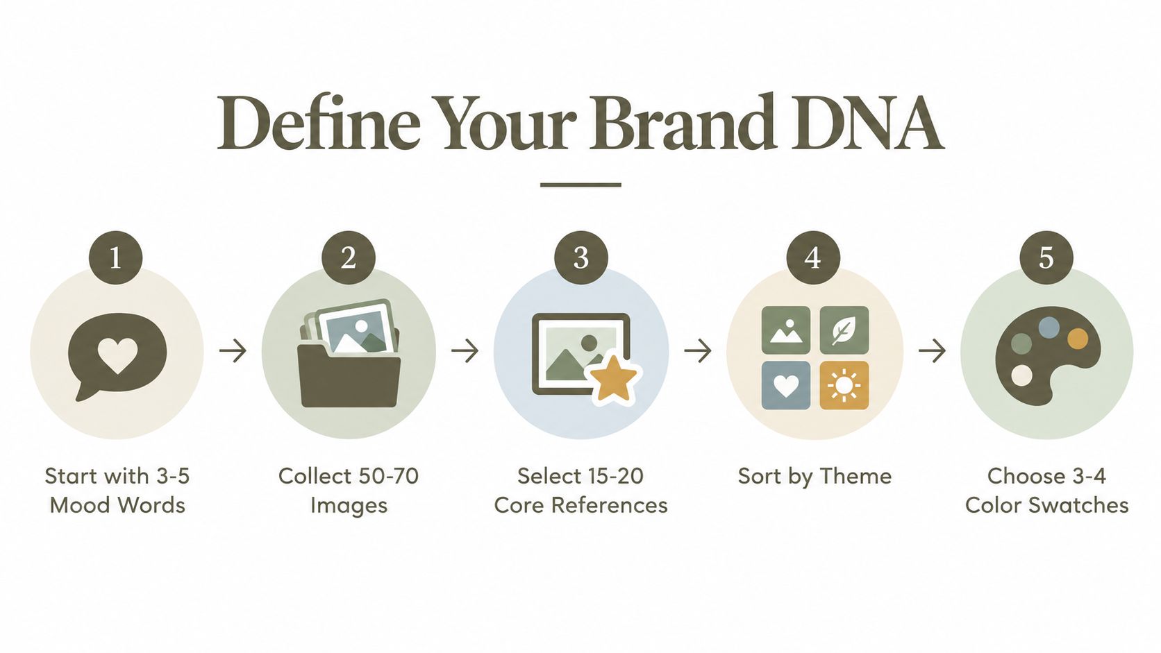
A disciplined workflow helps. Define the mood in 3 to 5 adjectives, collect 30 to 60 references, then cut to 12 to 18 images that hold together as one brand world, based on Digital Polo's mood board workflow guidance.
Here's the process asset I'd use to explain that internally:
Start with words before images
Start with language sharp enough to exclude things.
“Minimal” does not do much on its own. “Minimal, tactile, softened, architectural” gives a team a real filter. “Playful, glossy, youth-driven, saturated” does the same in a completely different direction. Good mood words shape choices in silhouette, finish, type, cropping, material, and styling. Weak ones only sound good in a brand deck.
Use words that create boundaries:
- Useful: “Structured”
- Weak: “Amazing”
- Useful tension: “Refined but not delicate”
That last type of phrase matters. Brands usually live in controlled tension, not in a single adjective. In fashion, I often see teams get much better results once they define what the brand is and what it refuses to become. “Luxury but not ornate.” “Natural but not rustic.” “Technical but still warm.” Those distinctions save hours later, especially if the board will feed AI workflows for consistent collections.
Build a broad first pass, then sort by function
Collect more widely than you plan to show. Pull from editorial photography, product close-ups, packaging, interiors, trims, hardware, retail environments, printed matter, textile swatches, and typography specimens. Different categories reveal different parts of brand DNA. Editorial might capture attitude. Packaging might clarify finish level. A store interior might show how much visual tension the brand can carry.
The mix matters because stakeholders tend to over-index on one type of reference, usually campaign photography. That creates boards that feel atmospheric but say very little about materials, hierarchy, or product construction.
A practical distribution looks like this:
- Photography references: 4 to 6 images for tone, styling, and point of view
- Palette references: 2 to 4 examples that show how color behaves
- Typography references: 2 to 4 samples that suggest voice and hierarchy
- Texture or material references: 2 to 3 visuals that define tactile language
That balance keeps the board usable. It also makes AI outputs less erratic, because the system is getting direction across multiple design variables instead of one emotional signal.
Cut harder than feels comfortable
The board either sharpens or collapses.
The first round should be generous. The final board should be selective enough that every image earns its place. In client reviews, the weakest boards usually contain too many “maybe” references. One image brings the right color temperature but the wrong silhouette. Another has the right texture but the wrong level of polish. A third is beautiful, but it introduces a visual code the brand cannot support in product or marketing.
Remove them.
Use a practical filter when culling:
- Does this image express at least one core mood word clearly?
- Does it agree with the rest of the set, or does it introduce a competing brand story?
- Could a supplier, marketer, or junior designer misread it?
- Is it useful, or are you keeping it because the board feels too sparse without it?
Sparse is often better. A tight board gives clearer instructions than a crowded one.
The goal is not variety for its own sake. The goal is a reference system that can generate consistent concepts, cleaner specs, and fewer subjective debates once the work moves into production.
Build a Clear Layout With Color Texture and Typography
A board can have strong references and still fail in the room.
The failure usually happens during review. A founder reads one image as premium minimalism, the merchandiser sees bohemian craft, and the marketer fixates on a single accent color that was never meant to lead. The issue is rarely taste alone. It is layout. If the board has no visual order, stakeholders invent their own, and AI tools do the same when you use the board to prompt concepts later.
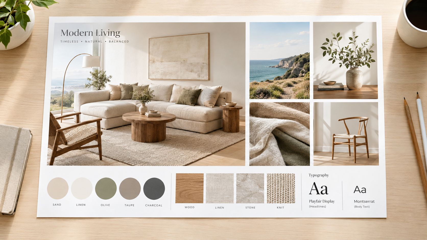
Use a tight grid and clear hierarchy
A simple grid solves more problems than another round of explanation. I usually build brand boards on a 3x4, 3x5, or 4x4 structure because those formats force selection and make comparison easy. If every reference has room to sprawl, weak images stay in the file too long.
Start with one or two hero images that define the main attitude. Then place smaller references around them to clarify supporting variables such as palette, materials, and type. Equal sizing sounds fair, but it creates noise. The eye needs a lead signal first and supporting evidence second.
A few choices improve readability fast:
- Place the anchor image first: Put the image with the clearest brand attitude where the eye lands naturally, usually upper left or center.
- Cluster by design variable: Keep color, material, and typography references near each other so people can compare instead of hunt.
- Leave deliberate white space: Empty space gives the board structure and keeps secondary references from competing with the hero.
- Align edges and crop consistently: Clean crops make the board feel resolved. Inconsistent cropping makes it feel like a scrapbook.
This is the trade-off. Dense boards feel energetic, but they also invite mixed interpretation. Sparse boards can feel underdeveloped to a nervous stakeholder, yet they perform better once the board has to guide product concepts, packaging, renders, and campaign assets.
Make color and type usable, not decorative
Color needs proof.
If the palette includes warm chalk, tobacco brown, and oxidized green, those colors should appear in the imagery, not as isolated swatches pasted into a corner. Otherwise the swatches read like late additions instead of part of the brand system. I prefer 3 to 4 core swatches with codes attached, because that is enough to set direction without creating false precision too early.
Typography should work the same way. Show the type in context and label its role. A serif may carry editorial authority in headlines but fail at dense product information. A clean sans may handle specs well but flatten a fashion brand if it takes over everything. The board should make that division obvious.
Useful type labels are short:
- Headline
- Body
- Product spec
- Packaging callout
- Campaign overlay
That level of labeling turns the board from a collage into a decision tool. It also gives AI image and content workflows better constraints, because the system is no longer guessing which visual signals matter most.
Show tactile cues for physical products
Consumer brands live or die on finish quality. A board that only shows wide lifestyle photography leaves too much open to interpretation.
Include close references that show surface grain, luster, edge paint, stitching tension, hardware weight, glaze variation, or weave density. In fashion and home goods, those details shape perceived price point faster than a mood word ever will. I have seen teams approve a beautiful board, then reject first-round concepts because the leather looked too glossy or the metal felt too cold. The board could have prevented that.
Keep annotations brief and functional:
- Color: swatch name plus code
- Type: role, such as headline or body
- Material: pebbled, brushed, washed, glazed, dry, crisp
- Imagery: side-lit studio, overcast lifestyle, close-crop editorial
Export the final board as a PDF or presentation slide that stays legible at reduced size. If a factory partner, freelancer, or AI operator cannot read the notes at a glance, the board still is not operational.
Turn Your Mood Board Into Actionable Brand Rules
This is the step that is skipped. They make a nice board, get approval, and then act surprised when product concepts, AI renders, campaigns, and packaging all drift in different directions.
A board becomes operational when you translate the visual choices into rules people can execute. Nielsen Norman Group notes that stronger workflows don't stop at collecting and arranging images. They include review, selection, organized layout, and sharing with the team, while current design guidance increasingly frames mood boards as collaborative artifacts with commentary and feedback loops rather than one-off inspiration files, as discussed in Nielsen Norman Group's article on mood boards.
This checklist view is useful for that translation step:
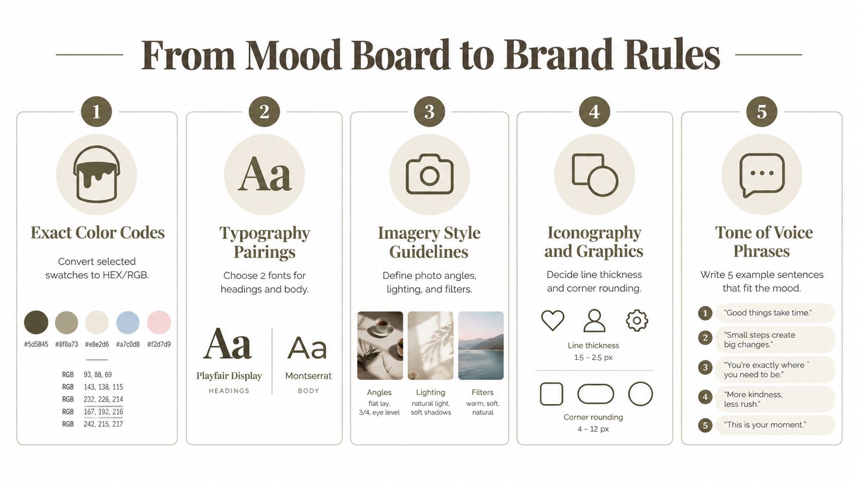
Translate every visual choice into a decision rule
If the board includes a muted clay tone, don't stop there. Record the exact color code and define where it belongs. Is it a base color, a lining accent, packaging background, or digital support tone? If the typography feels editorial, specify which font handles headlines and which one handles dense product information.
The same goes for imagery. “Aspirational” is vague. “Soft directional light, cropped close, low prop density, natural surface textures, restrained retouching” is useful.
For physical environments, retail, and event presentation, this rule-based approach matters just as much. Teams working on pop-ups or trade environments often need references that go beyond mood into buildable direction, which is why a resource like Exhibition Stand Design can be helpful when you need to see how aesthetic direction carries into spatial materials, surfaces, and branded structures.
From board to system
Use a simple conversion table and keep it attached to the board file.
| Mood Board Element | Brand DNA Rule | Example Application |
|---|---|---|
| Desaturated stone palette | Use approved neutral as the primary base tone across product and packaging | Main body color on handbags, carton background on launch mailers |
| Sharp serif headline reference | Use serif for campaign headlines only, pair with clean sans for functional copy | Homepage hero title with sans product details below |
| Brushed hardware close-up | Metal finishes should avoid mirror polish and lean matte or brushed | Zippers, logo plaques, buckles, display fixtures |
| Cropped editorial photography | Favor close framing and low-clutter backgrounds | E-commerce secondary images, campaign social assets |
| Soft woven texture | Materials should feel tactile, not slick or high-gloss | Fabric selection, lining references, set styling surfaces |
Add do and don't examples
Written rules get stronger when you add contrast. Show what belongs and what breaks the system.
That might look like:
- Do: low-saturation neutrals with one controlled accent
- Don't: bright candy hues that overpower material nuance
- Do: confident serif headlines with generous spacing
- Don't: compressed display fonts that feel aggressive
- Do: natural surface texture and imperfect tactility
- Don't: ultra-slick glossy finishes unless the category specifically needs them
For AI-assisted concepting, these rules are what keep outputs from wandering. They also make collaboration cleaner when multiple people are prompting, editing, and approving. Teams that want a shared process for this can use proactive AI creative workflows to connect mood direction with downstream concepting and asset production.
Don't hand off a mood board alone. Hand off the board plus the rules that explain how to repeat it.
Common Mistakes That Weaken Your Mood Board and How to Fix Them
Most weak boards don't fail because the designer has bad taste. They fail because they try to solve too many directions at once.
One of the clearest failure modes is overload. Guidance from Inkbot Design flags boards with 20+ images and dozens of swatches as a common cause of stakeholder overwhelm and decision paralysis, while many practitioners cap each direction at 4 to 6 core images and 3 to 4 color swatches, according to Inkbot's guidance on mood boards.
Here's the simplest way to diagnose that problem visually:
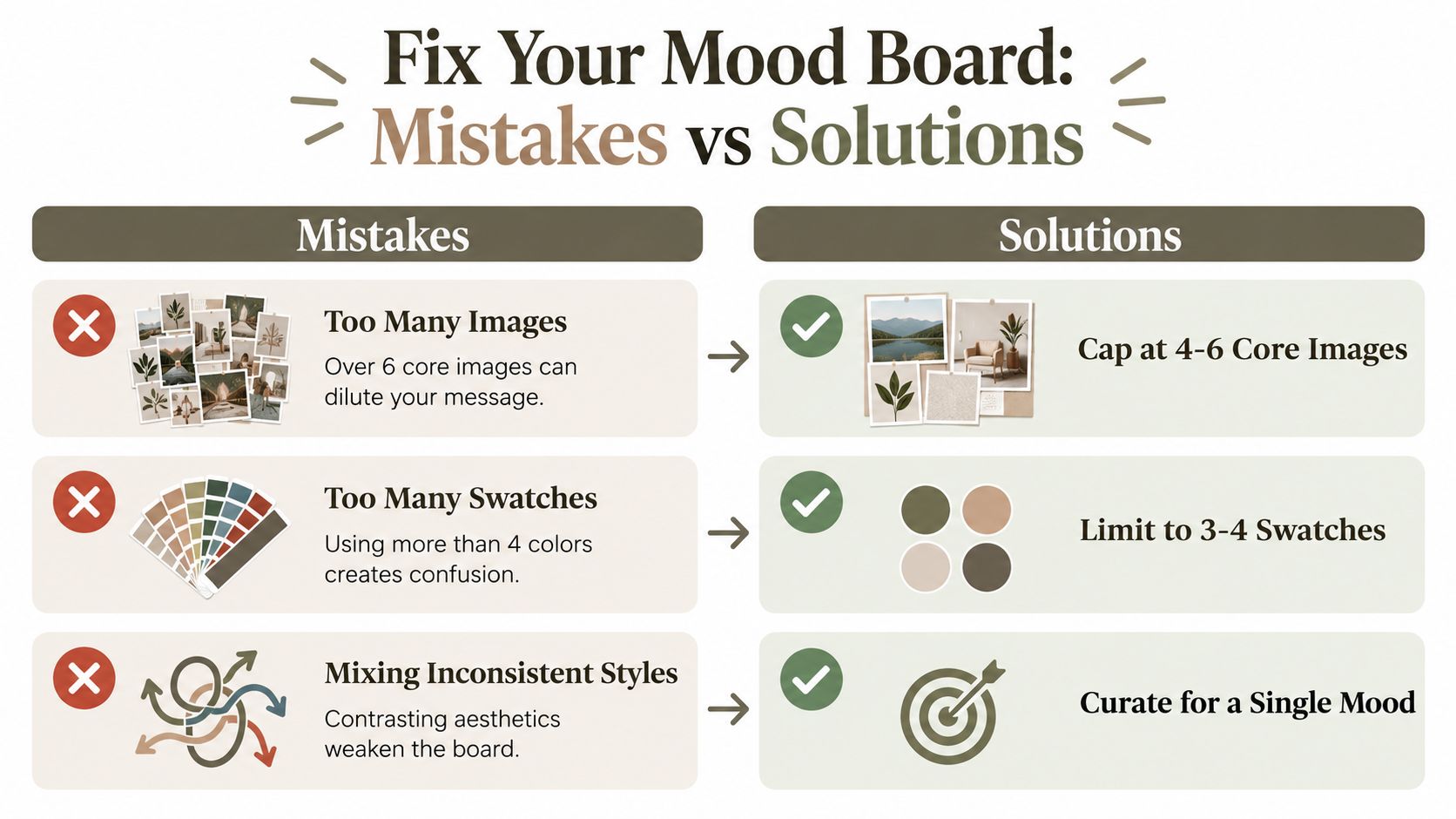
Overloaded versus focused
Use this comparison when a board feels off but no one can explain why.
| Problem board | Focused board |
|---|---|
| Too many images competing for attention | A few core references carry the message clearly |
| Every color you liked made the final cut | A tight swatch set defines the palette cleanly |
| Typography, imagery, and materials come from different worlds | All elements support one recognizable direction |
| Requires a long verbal explanation | Reads quickly in a review meeting |
The fix is rarely subtle. If the board is crowded, remove before you refine. Rearranging clutter doesn't create clarity.
The three mistakes I see most often
Too broad
This happens when the team wants the brand to feel modern, nostalgic, playful, premium, raw, and polished all at once. Those words may not be fully incompatible, but they need hierarchy. Decide what leads and what supports.
Too literal
A literal board repeats the product category without expressing the brand. For example, every image is just another handbag, sneaker, candle, or chair. That doesn't reveal tone. It only repeats the object. Add references from materials, architecture, photography, styling, and layout to build a richer language.
Visually inconsistent
Inkbot's guidance also notes that when a direction is mismatched, the first things to replace are often the most dominant signals, especially headline type and the most saturated color, because small tweaks rarely fix a wrong board. This is exactly right. One loud font or one aggressive swatch can hijack the whole read.
When a board feels wrong, don't adjust the margins first. Replace the dominant mismatch.
A fast self-audit before review
Run through this checklist before you share the board:
- Can someone describe the brand in a few words after one glance
- Do the strongest images agree with each other
- Is there one color or type choice pulling the direction off course
- Would a supplier misunderstand any image as a product instruction
- Have you included references because they're useful, not because they're expensive-looking
- Should this be two separate directions instead of one compromised board
If the answer to the last question is yes, split it. Two clean directions beat one muddled “everything board” every time.
Apply Your Brand Mood Board for Consistent Product Concepts
Once the board is approved and converted into rules, it should move into everyday use. The work starts paying off.
For concept generation, the board gives you the inputs that matter: silhouette attitude, material cues, finish level, palette boundaries, and imagery behavior. Those cues help AI-generated product concepts stay on-brand instead of drifting toward generic outputs. The same references can guide multi-view visuals, edits to hardware or trim, and technical development choices before a tech pack is fully built.
The board also helps across handoffs. Product design can use it to frame concept reviews. Technical design can use it to preserve the intended material and finish language. Marketing can use it to keep launch imagery, campaign styling, and e-commerce assets aligned with the same visual system.
Put the board where teams can actually use it
A mood board locked in one designer's desktop folder won't help anyone. Export it in formats people can open quickly, and keep a version with concise annotations for suppliers and external collaborators.
Store it as a reusable brand asset, not a presentation artifact. If you're generating new directions often, a tool that supports shared visual inputs can make that easier. For early-stage ideation, an AI product idea generator can help teams move from mood direction into concept exploration while keeping the source aesthetic visible.
A practical next-step checklist
Before your next product drop, make sure you have:
- A board with a clear visual hierarchy, not a loose collage.
- A reduced final set of references that all support the same direction.
- Color, type, material, and imagery rules written in plain language.
- Do and don't examples for anyone creating concepts or campaign assets.
- A shareable file version for internal teams, suppliers, and freelancers.
That's what turns a mood board into Brand DNA. Not just approval. Repeatability.
Genpire gives product teams a way to carry this process forward, from Brand DNA and visual references into AI-generated concepts, technical specs, and downstream production assets in one workflow. If you want your mood board to drive real product development instead of sitting in a slide deck, visit Genpire.