You've got a buyer call tomorrow and a factory asking for the side view you never drew. The hero image looks finished. Nobody can tell whether the zip sits on the left, how deep the bag is, or whether that leather is a confirmed spec or a pretty guess.
That's the usual failure when people learn how to make product mockups. The picture persuades. The file doesn't. Buyers read size and use off the image. Factories read seams, materials, and dimensions. If those two readings don't match one spec, you pay for it in samples.
Treat every view as a truth layer. Tie it to a spec, label anything generated, and put a version on the file before it leaves your desk.
Table of Contents
- Choose the Right Starting Point for Your Mockup
- How to Build a Multi-View Mockup Step by Step
- Add Scale, Try-On and Scenes Buyers Trust
- Label AI Visuals and Audit Every Claim
- Export Assets for Marketing and Factory Teams
- Validate With Buyers Before You Order Samples
Choose the Right Starting Point for Your Mockup
The most common wrong start is a blank canvas and a prompt that says "a nice bag" before you've named the decision the picture has to support. Attractive variants pile up. None of them settle silhouette, colourway, or first buyer reaction.
Four inputs fix that, and each one wants a different tool.
Text prompts suit early category exploration. Describe the category, the audience, and the problem the product solves, then compare several rendered variants in a text-to-image generator. We often start that pass from a prompt, a reference, or one of 500+ ready-to-edit blanks, and we keep only the direction that matches the decision.
Sketches and flats suit silhouette and proportion. Drop a hand sketch, photo, or flat into a 2D drawing or photo editor and recolour on your own shape. Don't let the tool redraw an outline you already approved.
Reference images suit a look you already like, such as a competitor piece or a moodboard item, while you change materials and details. Lock the reference's proportions so a new finish doesn't change the fit.
Blank templates suit fast starts on common forms such as totes, mugs, or sneakers. Use a 3D or template tool when dimensions and geometry must stay exact, then restyle the base before you add hardware.
| Starting point | Best for | What you supply | Typical output |
|---|---|---|---|
| Text prompt | Early concepts and category exploration | Category, audience and the problem the product solves | Several rendered variants to compare |
| Sketch or flat | Silhouette and proportion work | Hand sketch, photo or flat drawn from any angle | Recoloured views built on your own shape |
| Reference image | Matching a look you already like | Photo of a competitor piece or inspiration item | Variant with the reference's proportions and new materials |
| Blank template | Fast starts on common forms | A base silhouette from a library | Editable base to restyle before adding details |
Write the one decision this mockup must support before you generate anything. A pitch needs a single front view. A factory quote needs a full set. When the product has to survive sampling, spend the time on choosing a production-accurate mockup generator instead of the prettiest render. A picture still has to become a digital prototype that can become a real product, so don't start in a tool that can't hold dimensions.
How to Build a Multi-View Mockup Step by Step
A polished front with a mismatched side is how factories quote the wrong product. Build the set in order, and don't skip a view because the hero already looks good.
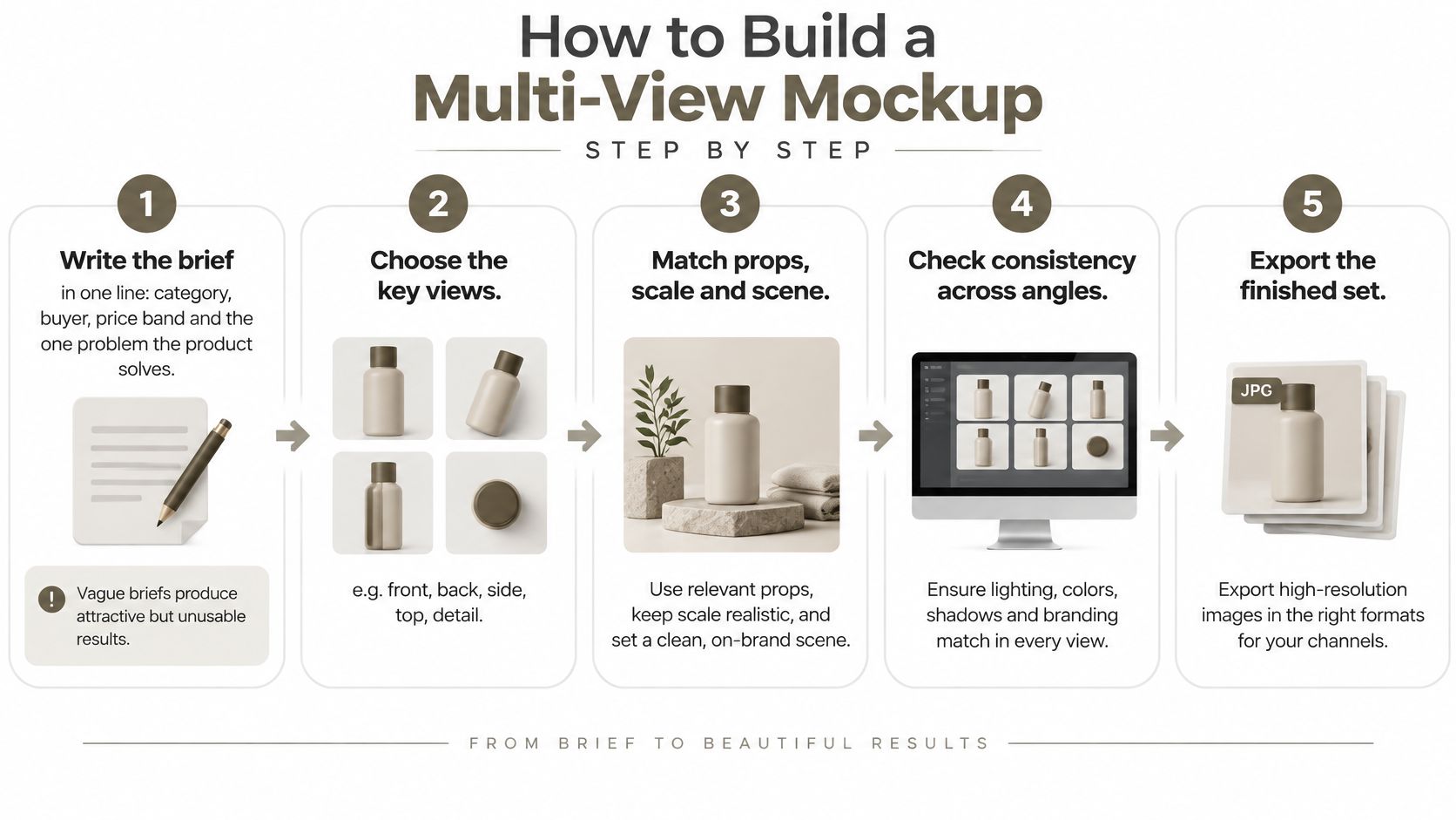
From one-line brief to a locked set
- Write the brief in one line. Name the category, the buyer, the price band, and the one problem the product solves. Vague briefs produce attractive concepts nobody can sample, price, or explain.
- Pick the starting point from the table. Prompt, sketch, reference, or blank. Mixing two starts in one pass is why the silhouette drifts halfway through.
- Set palette, proportions, and finishes before you draw. Every variant should share one look. Changing the strap width on variant three, and only there, creates a different product.
- Generate or redraw the front first. Approve its silhouette before anything else. If the front is wrong, side and back work is wasted.
- Add side and back, and check them against the front. Depth, closures, and panel positions have to land in the same place. Skipping this is why the side looks like another SKU.
- Add construction. Seams, stitching, fasteners, zips, or hinges. Mark anything you haven't confirmed as concept, in the filename or a corner label, so a buyer doesn't treat a guess as a spec.
- Save the set under the next revision. Later edits become v2. They don't overwrite the visual someone already approved.
Practical rule: If the front says 28 cm wide and the side implies a deeper body, stop. Fix the geometry before you light the scene.
The consistency check
Before you call the set finished, put the views side by side.
- One colour. The same swatch on every angle, not a warmer front and a cooler back.
- One scale. The product occupies a comparable share of the frame, or you show a scale bar.
- One lighting. Soft and even, so a shadow doesn't invent a seam.
- Agreed dimensions. Front width matches the side's corresponding edge.
I would not send a set that fails any of those four. A buyer can forgive a plain render. They can't forgive two views that disagree.
Add Scale, Try-On and Scenes Buyers Trust
Shoppers judge size and use before they judge beauty. Baymard Institute's large-scale e-commerce usability research found that 56% of users began exploring product images immediately after arriving on a product-detail page, before reading titles, descriptions, or scrolling, that 42% of users tried to determine a product's size from its images, and that 28% of sites provided no in-scale image at all.
A furniture, footwear, accessory, electronics, or home-goods mockup needs at least one scene that shows physical proportions. Three tools do that job without a photoshoot.
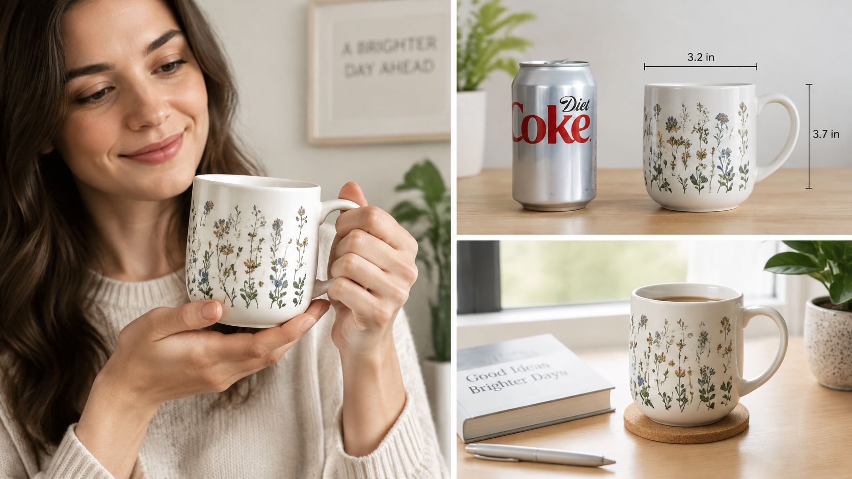
A person wearing or holding the item. A natural pose and even, softbox-style light show finish and fit. A mug in a hand, a tote on a shoulder, a sneaker on a foot. Crop tight enough to read hardware, loose enough to read scale.
A familiar object beside it. A key, a coin, or a standard mug. Pick one object and keep it. Swapping props between colourways makes the product look like it changed size.
The product in its real setting. On a shelf, a desk, or a bag hook. The scene should show where it lives, not a lifestyle that implies a larger body than you can manufacture.
What to keep identical
- Lighting, camera height, and background stay the same across colourways, or colours can't be compared.
- A close-up of hardware and closures sits next to the wide shot, because that's what buyers zoom into.
- One plain view with no props stays in the set for the factory. Props are for buyers. They are not a spec.
A single hero angle, a scene that suggests a size the product doesn't have, and different lighting between variants are the three mistakes that create returns before you've even sampled. Run this test. Could a buyer estimate the item's length from the set alone, without reading the dimensions? If not, add a scale view before you publish.
Label AI Visuals and Audit Every Claim
A photoreal hero is the risk, not the prize. It implies a finished product when you may only have a concept. Clutch's 2025 survey reported that 57% of participants incorrectly classified AI-generated photos, while 84% said disclosure was important and nearly 40% said undisclosed AI imagery could reduce brand trust.
Three habits keep the image honest.
Label it. Put "concept" or "AI-generated" on the image or the page when the variant doesn't exist yet, on a preorder, or on a crowdfunding page. Disclosure matters most when the picture could change what someone expects to receive.
Separate rendered features from confirmed specs. List what is locked (silhouette, main material, colour code) and what is still open (hardware finish, stitch density, lining). If it isn't in the spec, it isn't a promise.
Match proportions and materials to what a factory can make. A rendered grain, a metallic sheen, or a recycled-looking kraft graphic doesn't create a material. McKinsey's 2025 global survey covered consumers in 11 countries representing 66% of global GDP and found that 40%–80% were willing to pay more for sustainable packaging depending on the market, while environmental impact was rated extremely or very important by 51% globally and recyclability ranked as the leading sustainability trait.
A slightly more explicit concept treatment builds better expectations than a photographic image that suggests the product is ready to ship.
| Visual cue | What buyers read into it | What to confirm first |
|---|---|---|
| Photoreal hero render | Product is ready to buy | A sample exists and matches the image |
| Kraft or leaf-style graphics | Eco-friendly or recyclable | Material and disposal claim appear in the spec |
| Recycling symbol on a pack | Recyclable in every market | Local recycling rules and recycled-content share |
| Lifestyle scene with props | Realistic size and use | Scale reference matches the real dimension |
| Missing side or back view | Nothing is hidden | Full view set and construction details exist |
The claim-audit rule is simple. Every claim a visual makes, about materials, finish, or recyclability, needs a source in the spec before publication. If the spec doesn't say it, take it off the image.
Export Assets for Marketing and Factory Teams
An approved mockup set leaves your desk as a specification package. The controlled reference is an orthographic set: front, side, rear and top views, with scale or key dimensions, material and finish references, callouts for interfaces, seams, fasteners, tolerances and moving parts, plus a version identifier on every file so a supplier never quotes from an obsolete drawing.
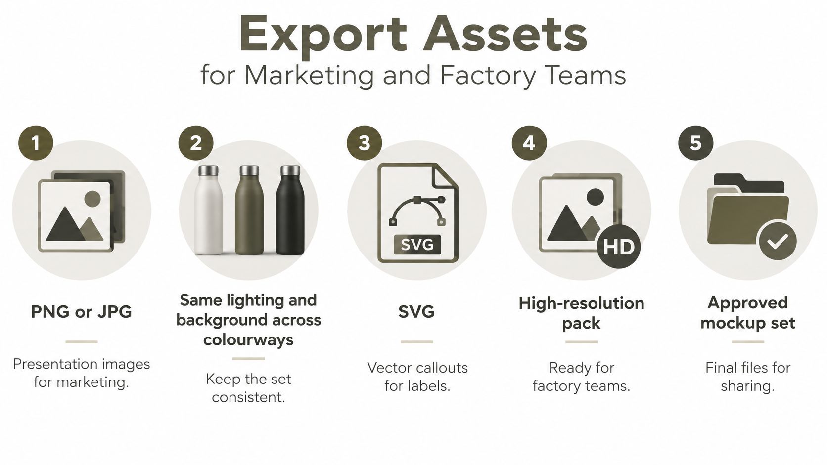
Marketing takes the images. Factories work from the PDF and the callouts. Sourcing uses the material list to request samples. Send only the presentation image and you are asking a factory to guess manufacturability from a camera angle. Genpire exports to SVG, PDF and Excel for exactly this split, and free view-only seats let a supplier comment on one shared file rather than a chain of attachments. Pair the export with a spec sheet a factory can actually follow.
| File | Audience | Used for | Must include |
|---|---|---|---|
| Presentation images (PNG or JPG) | Marketing | Hero and colourway visuals | Same lighting and background across colourways |
| Vector callouts (SVG) | Factory and marketing | Labels for seams, fasteners and interfaces | Sharp at any size |
| Dimensioned PDF | Factory | Front, side, rear and top views | Key dimensions and a scale bar |
| Component and material list (Excel) | Sourcing | Requesting samples | Part name, material, colour code and finish |
| Version ID in every file name | All teams | Stopping review of obsolete files | Version number and date |
Before anything leaves your desk
- One perspective only. Add the orthographic set, or the quote will be based on a flattering angle.
- Callouts left out of the factory PDF. SVG labels that live only in the marketing folder never reach the sample room.
- Presentation image sent as the spec. A render carries no tolerance, clearance, or bill of materials.
- No version and date in the filename. Suppliers will open last week's file and you won't know until the sample arrives.
Keep geometry, camera, lighting, and colour management identical across revisions so reviewers compare design changes instead of render changes. Note unresolved assumptions next to the file, and when sign-off comes back, record more than an approval rate; a single number hides where a reviewer stalled. I treat the dimensioned PDF as the controlling document: when a hero image and a callout disagree, the callout wins.
Validate With Buyers Before You Order Samples
Don't commit to a tech pack or a bulk order on a picture your team already likes. Pick one question. Do shoppers understand the closure? Do buyers see the price as a fit? Anything wider and the session turns into opinions about taste.
Parallel's prototype-testing guidance says to prepare 3–5 realistic task scenarios, recruit participants who match the intended buyer, and use a practical benchmark of 5–8 representative participants for early usability work, while published UX guidance commonly reports that five users reveal roughly 80–85% of major usability problems. Larger samples are what you need for reliable quantitative estimates. Use the lowest-fidelity artifact that can answer the question. A sketch for hierarchy. A clickable mockup for interaction. A dimensionally accurate prototype for fit and assembly.
Scenarios that work are concrete. Find the size. Choose a colourway. Describe what the product does in one sentence. Record task completion, time on task, errors, hesitation, and comments. Split each task into view, select, and confirm so you can see the exact step where people stall. An overall "they liked it" hides the moment they couldn't find the closure.
Testing with the wrong audience produces misleading reassurance. Recruit people who would actually buy, not colleagues who already know the brief.
Rank findings by frequency, severity, and business impact. Fix the top items. Retest only the riskiest change. Document the version, the conditions, and the participant profile, because a small sample reveals problems and cannot prove population-wide success. Excessive polish distracts people from the question, so don't beautify the file the night before the test.
Genpire lets you generate visualizations and gather feedback from potential customers before you commit to a tech pack and a bulk order. You can also upload a tech pack, 3D files, sketches, or detailed specifications when you order a prototype. Move the approved, labelled, and versioned set into that request, and use virtual product validation on the one question that still worries you before you spend on samples.
Genpire turns a prompt, a sketch, or a reference into multi-view concepts, factory-ready specs, and the marketing images that have to match them. If you're about to send a mockup to a buyer or a factory, build the truth layer in one place instead of stitching hero renders to a spreadsheet. Visit Genpire and start from the decision your next sample has to prove.